Derwent Living Intranet (2013)
The old intranet was so very, very broken. Improving that wouldn't be hard; but the real battle would be making something people actually used.
Design: Steve Atkin

The old intranet was so broken, it took 20 minutes to post a news item. Search just returned every page in the same order no matter what you were trying to search for. Even saying "intranet" was like using a dirty word. So on the one hand, we wouldn't have to do much to improve upon it; on the other, getting people to actually use the replacement was going to be a real battle.
We looked at Microsoft Sharepoint, but found it difficult to set up using our Active Directory configuration, and didn't like how it split information and social aspects into two completely separate sites. So we decided to produce our own from scratch, looking elsewhere for inspiration.

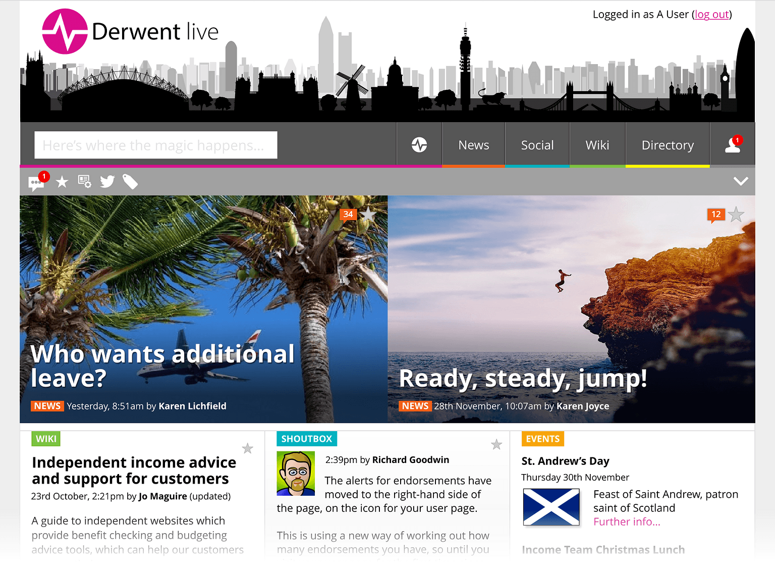
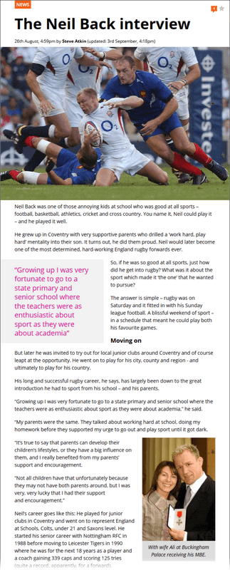
People were familiar with social media sites away from work, so sites such as Twitter and Facebook were our touchstones, along with Google for search, and Flickr for photo galleries. For articles we looked at sites we enjoyed reading - The Verge, BBC News etc. This was more how things felt than ripping off specific features. For example we liked the way articles on some sites were presented with ample borders down each side and yet large images used the full width, ignoring the borders. This made reading easier but the photos look bigger and more stylish, even if the page width was actually quite thin.
Having written CMS-style sites before, I was pretty confident that everything was going to be fine - apart from search. Not only had I not written anything but the most basic search before, but it was the number one feature that just had to be right to get people to forget the problems the old intranet. Left until last - as it would have to be able to search every feature, including the staff directory and user's comment - Steve kept asking, "how long do you think search will take to write?" And my answer was always that I didn't know - it could be two hours, it could be two weeks. He would also tease, "That's not the attitude Google would take," to which I'd reply "Yeah, but they have more than one guy writing everything". In the end both estimates were right: using a modified stemming algorithm I got basic search (storage and retrieval) working in just a couple of hours, but tweaking the weighting given to words in various different situations took a couple of weeks to get just right (basically long articles could use lower weights; staff directory entries needed higher weights because they were shorter).
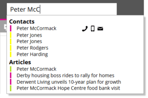
The search page was smart enough to know if you were searching for a person instead of an article, and if so present the directory results first.

As I'd hooked it in to the info on pictures in galleries, it could even show a bunch of images (as well as the usual staff head shots on their results). You could even click on the 'phone numbers to dial from the desk 'phone, as well as the usual email links. And in the end, very few people even saw the search page as the search-as-you-type drop-down was good enough for almost everyone, with past searches and clicked results displayed before you typed, and from three characters onwards the same "guess you're looking for people, click to dial" smarts in a compressed format.
Another fun memory was Steve telling a passing manager we were implementing nested comments on everything, so people could respond to news, correct wiki articles, or react to imported tweets. "That's a bit ambitious," he said in a tone of voice that seemed to suggest we'd never pull it off. Of course I'd written it that morning and we were already testing it.

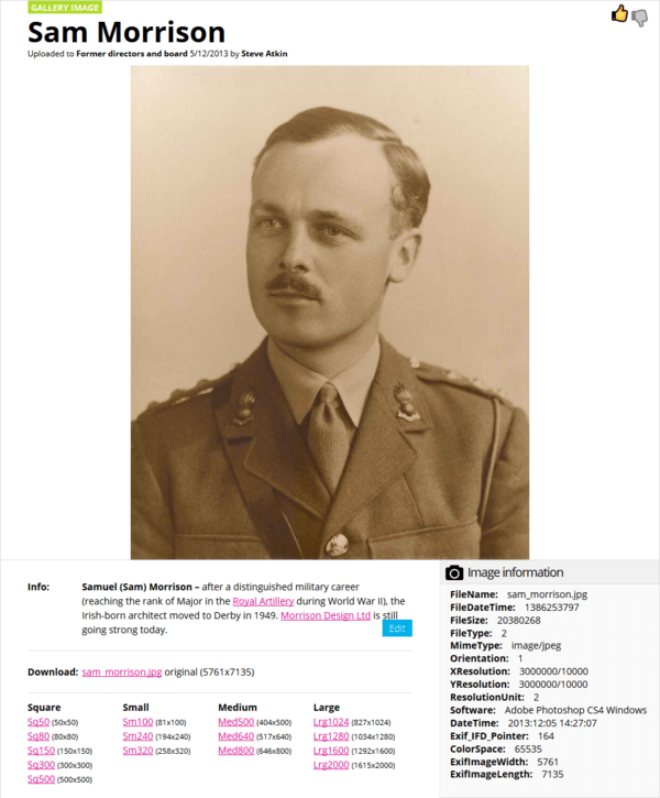
The part I was most pleased with was the imaging system, which I wrote before even planning the CMS. Instead of the WordPress way of creating copies of image at various sizes at upload, this allowed various sizes (and shapes) to be created on demand, and cached for future use. This meant less wasted space, but also allowed more sizes and use cases in the future (retina images for mobile; converting SVGs for PNG for older browsers; Flickr-style downloads at multiple sizes and shapes; heavily compressed employee photos for VCards). The retina images used a clever compression trick that could actually make them smaller than saving a "proper" image from Photoshop. It was a sort of CDN-style system, but without the distribution network. So... just content then.
The whole project took about six months from start to finish, which - apart from the occasional flashbacks from being so deep into one project for so long - I'm also pretty proud of.