Nevada project (1998-9)
A collaboration between Sony (SCEE) and ArgoNet to test online Playstations
ArgoNet was an ISP focused on providing connectivity to users of Acorn computers, which was a fairly small, niche community. So it seems only natural that Acorn Computers themselves would would start talking to Argo when they started creating thin client machines that needed an Internet connection.
And that's basically how a tiny company in sleepy Chichester came to work on a project for SCEE, the part of Sony that sold massively popular games consoles in Europe.
The Playstation itself couldn't connect to the Internet, but they wanted to test some online features no doubt with an eye on producing a future model that could. So we got a bunch of black Net Yaroze Playstations (the regular consumer ones were grey; apparently there was an even cooler developer version in blue), and used Acorn-based NetStation thin clients to handle the online stuff.
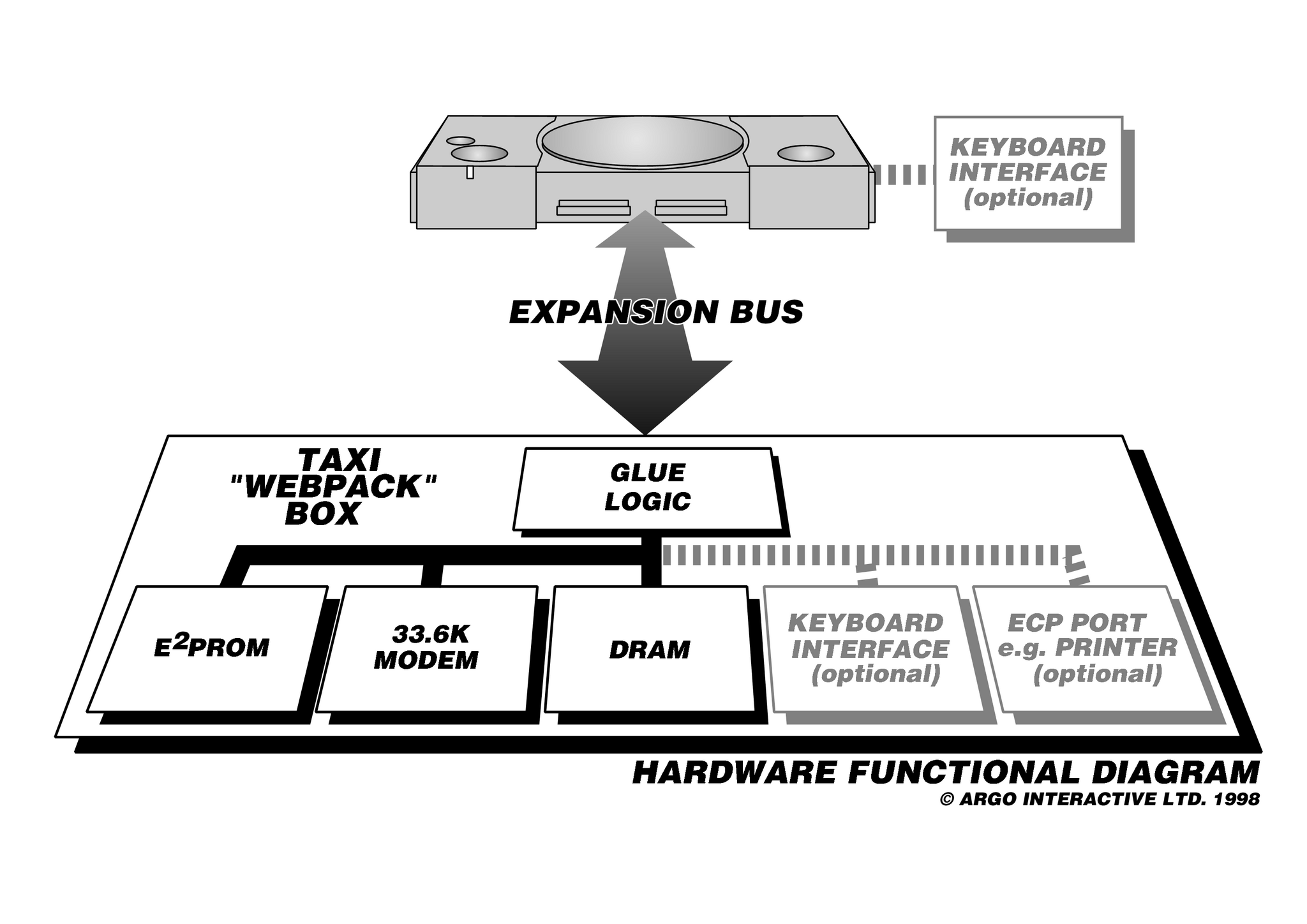
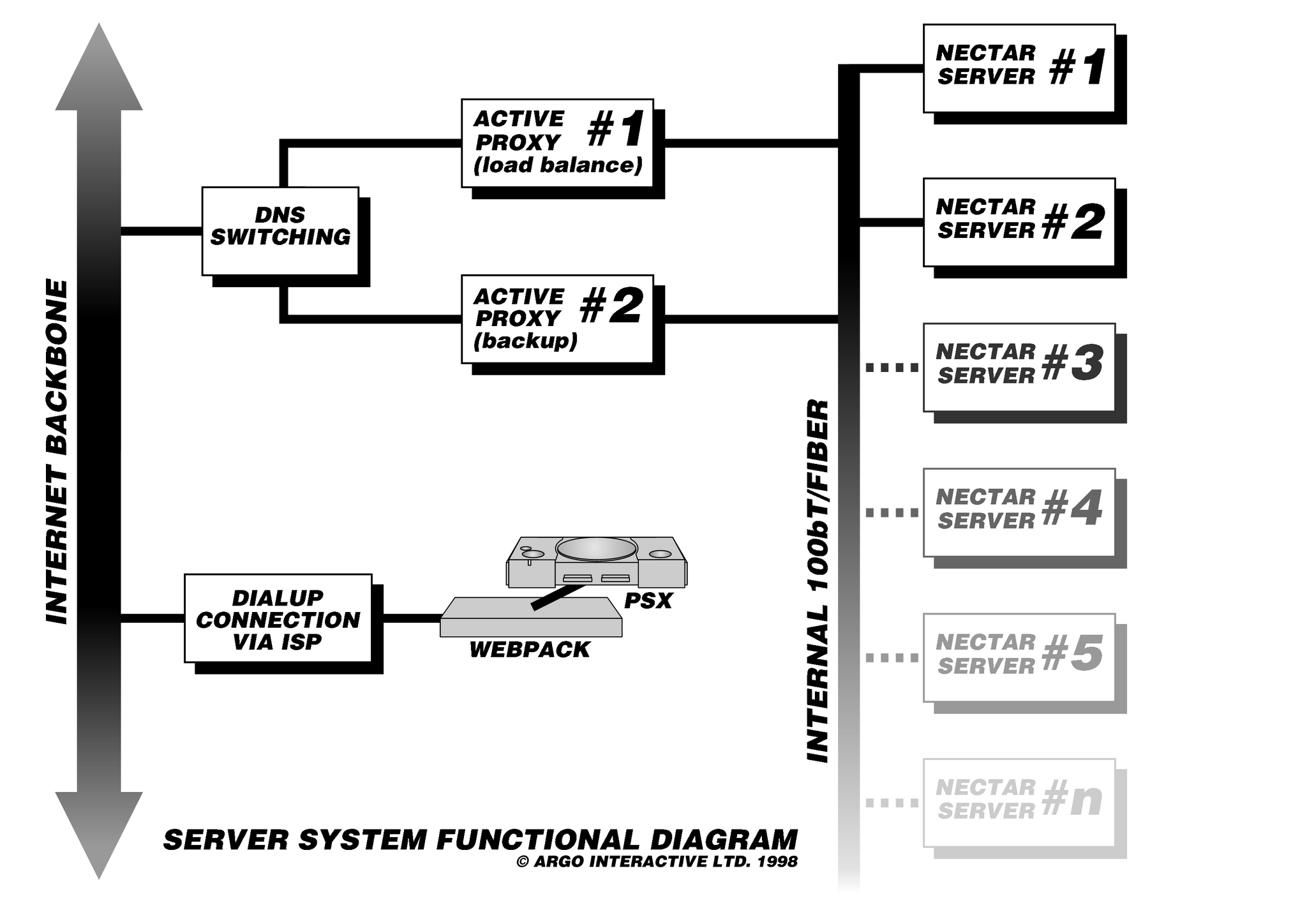
The modem card was replaced with a custom-built dual serial port card that allowed it to talk to both the Playstation and an external modem. Add in a power strip and a switch so they could both display on the same TV one at a time, and then the whole lot was literally glued on to a piece of board.

The firmware on the thin client was also heavily customised, to provide the new functions such as IRC-based chat and saved game swaps.
A couple of hundred of these boards were shipped all over Europe, but it was back home that caused us the most problems. The UK telephone provider BT needed to change some configuration setting to give us access to the network, but as soon as we'd get it sorted someone else would come along and switch it back. Repeat until end.
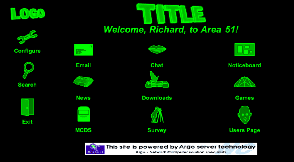
Most of this was well above my head, but I illustrated the project spec documentation, then designed an initial version of the web page controlling the device. As it was supposed to be just a proof of concept I did it in green vector images on a black background, like an old fashioned green screen monitor - stealing bits and pieces from my other graphics projects and stripping them of fancy fills or colour. It was supposed to be the visual equivalent of Lipsum, but somehow it proved popular and a stripped down aesthetic was chosen for the site.
I wrote the "style guide" for working with the browser - as the resident expert on web design for that particular browser I could tell them what pitfalls to avoid, and added some general design advice on designing for TV screens - e.g. make everything large as people would be sitting back further than they would when using a monitor, and (as TVs used CRT technology back then) to avoid using harsh transitions (e.g. white on black) as these would tend to flare up and the colours "bleed" in to each other. I said to my boss, these people work for Sony, I feel a bit weird telling them how to design for TVs, but that's what was asked for.


Of course, when their initial designs came through I was dismayed to find they'd done tiny black and white graphics. Not what should have been done for TVs, and obviously no-one had read the instructions I'd written. I ended up having to redesign everything to at least be bigger and a little less stark, although my attempts at introducing a little colour didn't always work out.
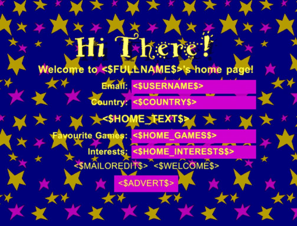
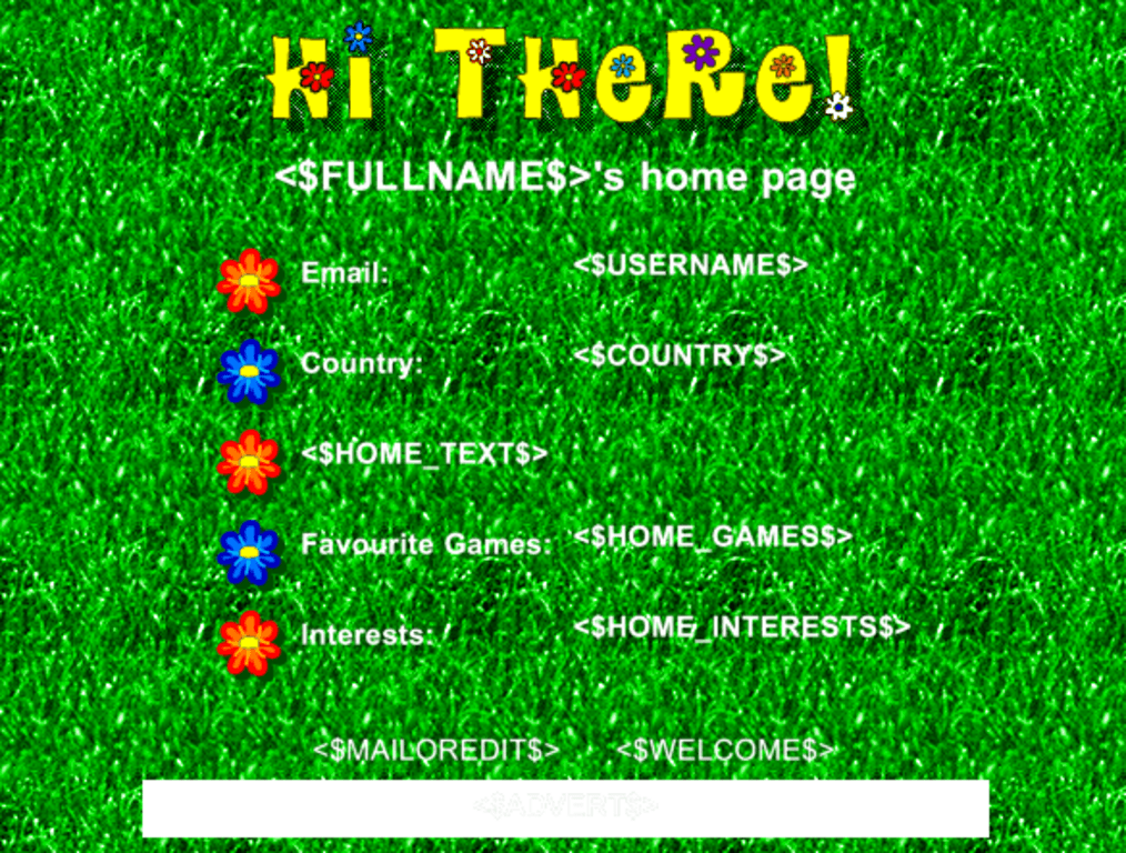
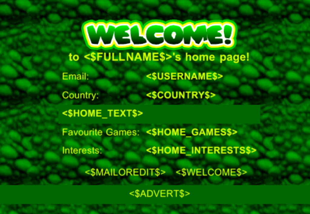
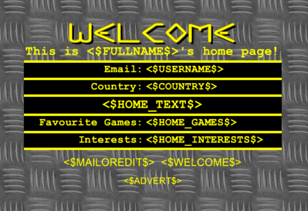
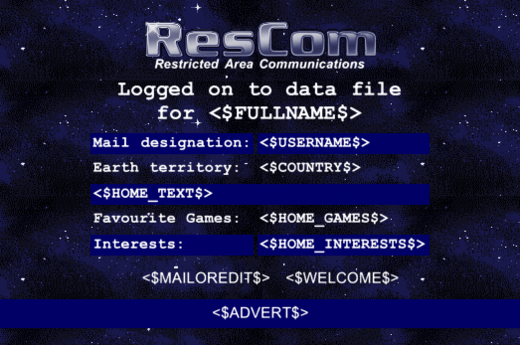
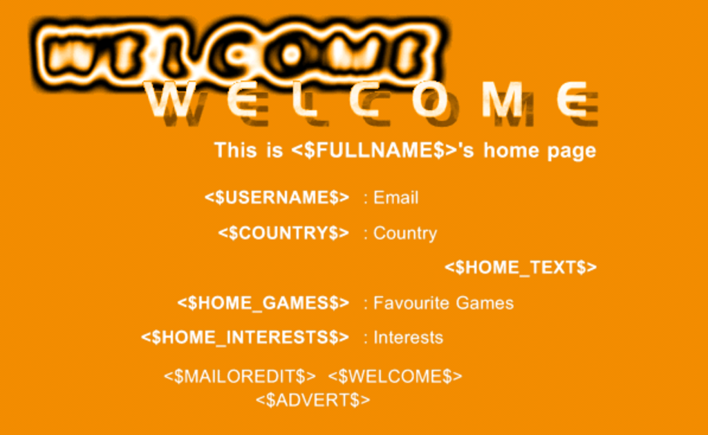
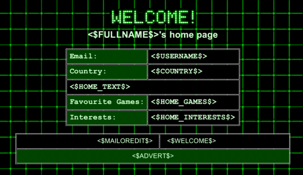
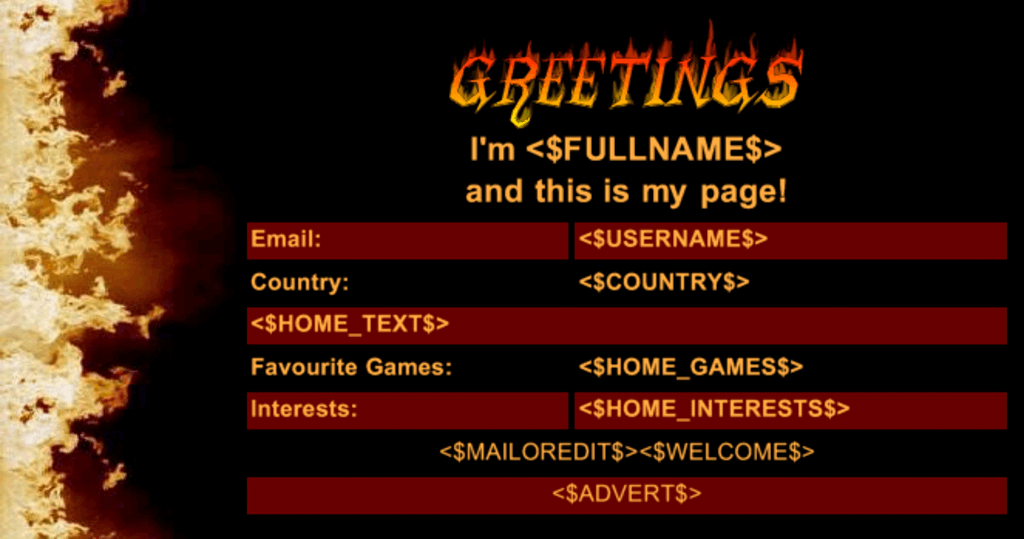
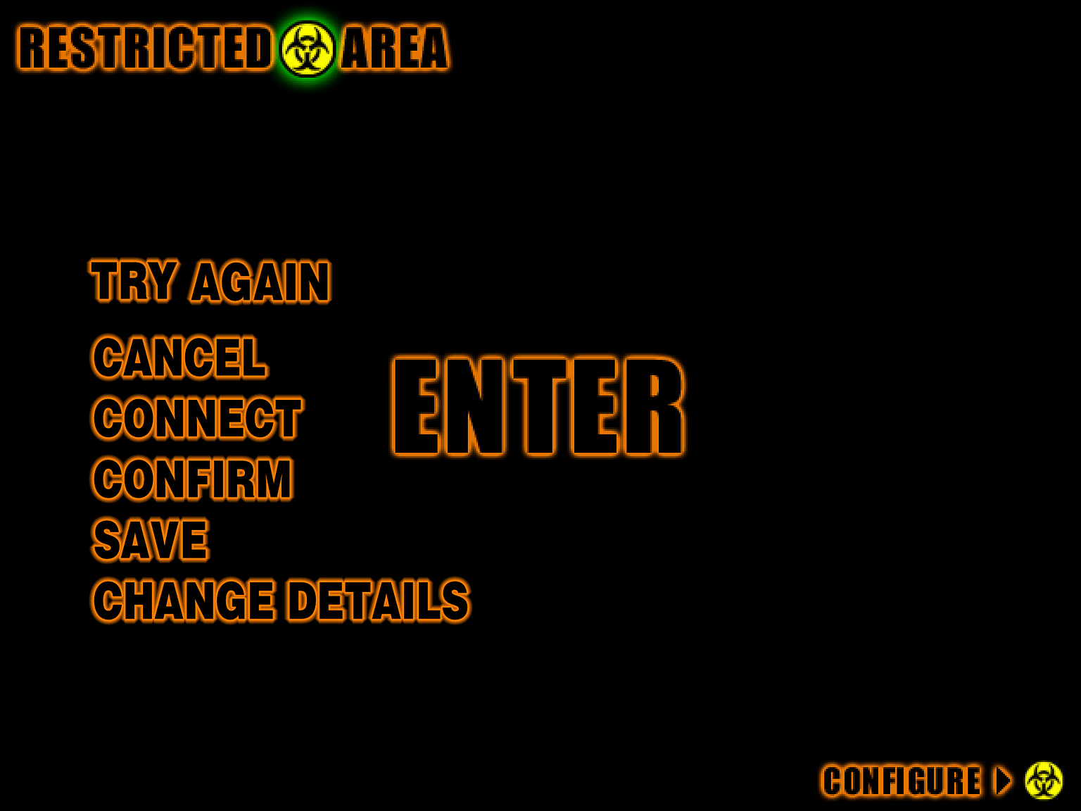
Where I could get my colour on was the user pages, were they could "design" their own home page. These were a bunch of templates I'd designed with spaces that would be filled out with the user's name, location, favourite game and a bit of biographical info. I made these as bright as possible, ranging from stark industrial and science fiction based designs to more feminine flowers and stars, with fire and lizard skin in between.
User themes
The user homepage themes aren't exactly subtle, but they were designed to be big and bold to work on a TV. Also, this was some cutting edge stuff in 1999. Probably.